

LeonFounder and CMO of djoon
A/B tests and user flow optimization for djoon
46
A/B tests in 6 months
Source: Labrigart figure, testing platform ABlyft
32
Tests in which the new version came out ahead
Source: Labrigart figure, testing platform ABlyft
For new clients: we design your mobile menu free of charge.See mobile designs
Conversion optimization for online stores: we find out why visitors do not buy, design your pages the way people decide, and measure the result.
No obligation · 30 minutes with David Pehl or Anas Elimani
180+ stores we have worked on, including:






















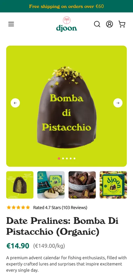
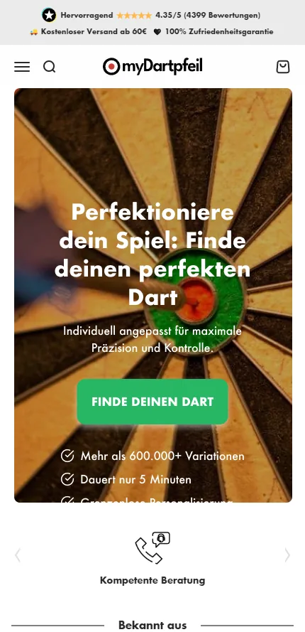
myDartpfeil Landing page
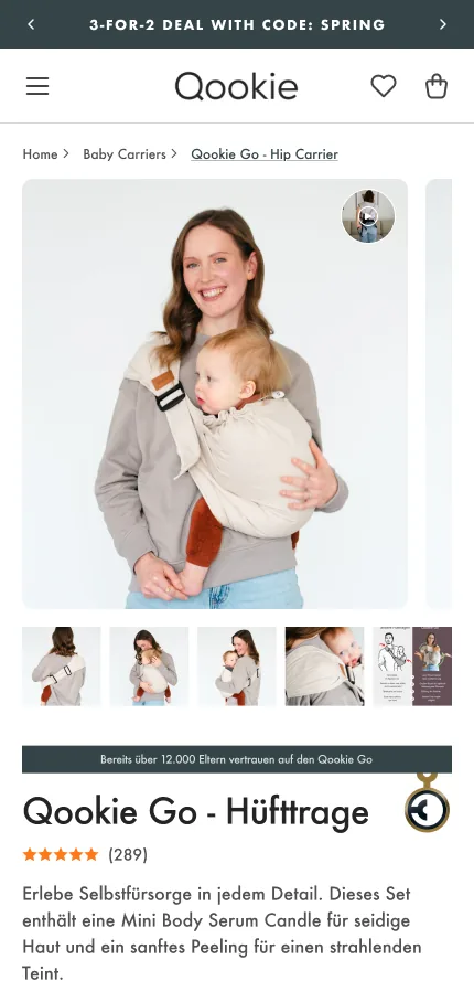
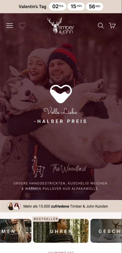
Timber & John Promotion page

Swan Skincare Landing page

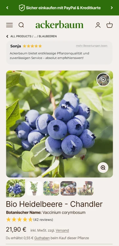
Ackerbaum Product page

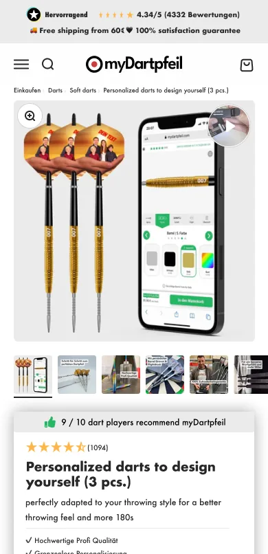
myDartpfeil Product page
Keep scrolling to see how we scale online stores.
Buying psychology
We map the path from first glance to purchase as five decisions. Behind each one is a question your visitor asks. Design based on buying psychology answers each question at the point where it arises.
Is this for me?
Image and first line show who the product is made for: on the page, and before that in the ad and the search result.
Am I in the right place?
The top of the page shows your visitor where they are and how to move on. The page delivers what brought them here.
Why this product?
The difference from the alternative is stated in one sentence, in your customers' words.
What could go wrong?
Reviews, trust badges and the return policy sit next to the price, where doubt arises.
Will I buy here again?
Delivery time and availability are stated honestly. Your customer holds you to that promise when the parcel arrives.
First hand
Our reviews in the Shopify Partner Directory are publicly visible.
LeonFounder and CMO of djoon
46
A/B tests in 6 months
Source: Labrigart figure, testing platform ABlyft
32
Tests in which the new version came out ahead
Source: Labrigart figure, testing platform ABlyft
Case studies
What holds shoppers back is different in every store. Four examples: what we found and what we built from it.
180+
stores we have worked on
€440M+
client revenue

Shopify ranks partners by experience and proven results, among other criteria.
5.0
out of 5 stars from 17 reviews
Shopify Partner Directory, as of October 2026 (opens in a new tab)


Conversion optimization with A/B tests
Starting point
Anyone who wanted to see another flavor had to load a new product page.
Result
46 A/B testsin 6 months, 32 of them with uplift

Starting point
The store ran on Shopware with complex inventory logic, and online there was no way to try shoes on.
Result
−10%Return rate


Conversion optimization and landing pages
Starting point
Often only one product ended up in the cart, bundles and subscription were barely visible.
Result
Bundle, subscription and food quiz now sit where the buying happens.


Starting point
New visitors did not know which supplement suited them and why.
Result
A routine finder shows visitors which supplement suits them.
The answer is in your numbers. In the intro call you describe your situation, we ask questions. Afterwards you know whether we can help and how we would proceed.
We are proud to be a Shopify Premier Partner.
Services
We look at where people hesitate and leave in your store. Then we design, test and build.
We find where your store loses buyers and change exactly that.
What wins in the test gets built in. Also bookable on its own.
From Shopware or WooCommerce to Shopify, with everything attached to it.
Pages that pick up visitors from ads and lead them to one action.
Your store redesigned from the ground up, the way your buyers decide.
Your team learns how buyers decide and how to test properly.
Design that shows what your buyer should do next.
Apps, integrations, configurators and finders for your store.
Results
Results from client projects, sorted by service: which problem we found and what changed for shoppers afterwards.
Our method
5 decisions lead to the purchase. 4 forces act on each one. In 5 steps we find the point where your store loses the most shoppers and redesign it.
We map the path to purchase as five decisions. Each can be read from one metric. Only one of the five is made at checkout.
The same four forces act on each of the five decisions. Five times four gives a grid of 20 review questions. Three of the forces were described by the psychologist Daniel Kahneman (1934 to 2024), who was awarded the Nobel Prize in Economics in 2002. Psychology sets the direction. How large the effect is in your store, we measure.
In five steps we find the point where your store loses the most shoppers and redesign it. We work in cycles of 6 months.
01 / 05Decisions
Is this for me?
Before anyone enters your store, they have decided whether to look or keep scrolling. Image and first line must show who the offer is made for. This decision can be read from the click-through rate.
02 / 05Decisions
Am I in the right place?
On arrival, your visitor checks whether the page delivers what brought them here and whether the store looks trustworthy. Whether a page appeals is decided in a fraction of a second. Read from the bounce rate of the entry page, meaning the share of visitors who leave right away.
03 / 05Decisions
Why this product?
On the product page, your shopper compares: with the alternative, with the price, with what they already have. A good page states the difference in your customers' words and gives an honest reason to buy today, such as delivery time or availability. Read from the share of visits with a filled cart.
04 / 05Decisions
What could go wrong?
Anyone about to order weighs up at the end what they could lose: money, time, the effort of a return. Hesitating here is normal. The answers must be right where the order is placed. Read from the completion rate from cart to order.
05 / 05Decisions
Will I buy here again?
After the purchase, memory decides. In hindsight, the strongest moment and the ending count most, the duration hardly at all. Our working hypothesis: the memory of the last purchase is the first impression of the next one. Read from the repeat purchase rate.
01 / 04Forces
how much effort the next step takes
What is easy to grasp seems more credible. The more a shopper has to puzzle over, the more likely they postpone the decision. That is why we check whether every page has one clear primary action.
02 / 04Forces
what is in view, how it is worded and what it sits next to
People judge by what is in front of them. The same information works differently depending on how it is worded and which reference value sits next to it.
03 / 04Forces
what the shopper fears losing
For most people, losses weigh more than gains of the same size. Our working hypothesis: taking a risk off the shopper often does more than one more argument. Whether that holds for you, we measure. We do not use fake countdowns or artificial scarcity.
04 / 04Forces
what other shoppers say and do
Those who are unsure follow others. Reviews correlate measurably with sales, weakly on average, and the number of voices counts more than the rating. We also check where those voices are placed.
01 / 05Steps
Where do we stand?
First we check whether your tracking is correct, meaning the measurement of visits and orders. With clean data we collect the metric for each of the five decisions, split by device and visitor source. No right decision can be built on wrong numbers.
02 / 05Steps
Where are the most shoppers lost?
We look for the decision where you lose the most shoppers in absolute numbers. A poor percentage at a point with few visitors weighs less. You see the order and the reasoning before we begin.
03 / 05Steps
Why there?
We check this decision against the four forces and show which one is at work: with customer feedback, data and a UX audit, meaning a review of the page for usability. In our experience, this is the step most often skipped.
04 / 05Steps
What do we change?
One hypothesis, one change. We redesign the spot, with copy, imagery and layout. We or your development team implement it, depending on the store platform.
05 / 05Steps
Did it work?
In an A/B test where order volume allows: some visitors see the current page, some the new one. How many orders the test needs, we set in advance. Otherwise in a before-and-after comparison with the uncertainty stated openly. What clearly blocks shoppers, we fix without a test.
The path is a circle: the return is followed by the next purchase, every test by the next measurement. We look most closely where the most shoppers are lost.
Mobile design
Most shoppers now arrive on their phone, and that is where the purchase is decided: on a small screen, with one hand. That is why we design for the thumb first.
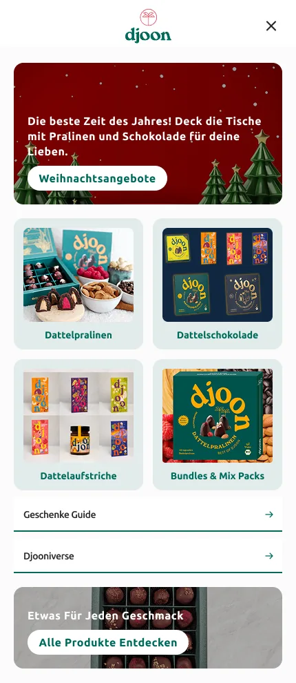
djoon
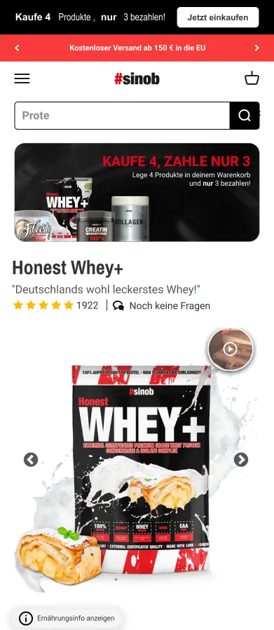
sinob
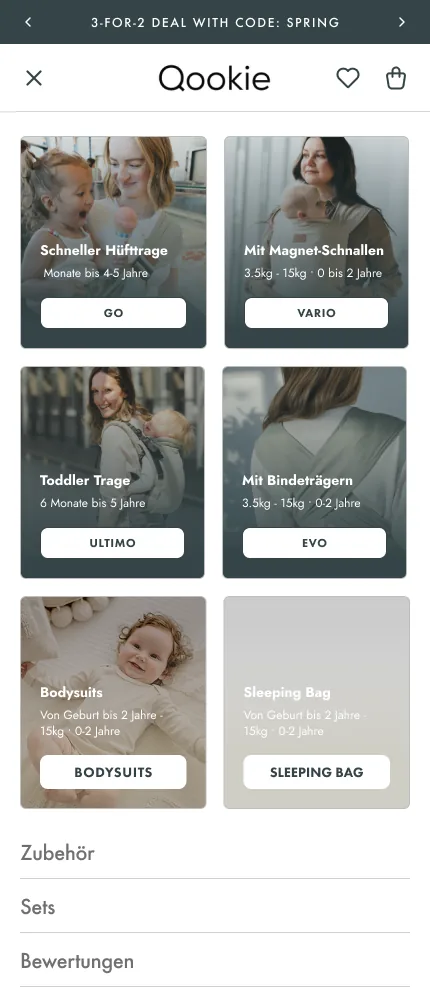
Qookie

mica mica
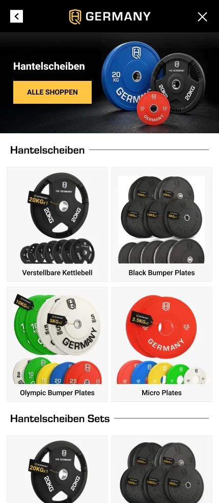
HQ Germany

Sugargang
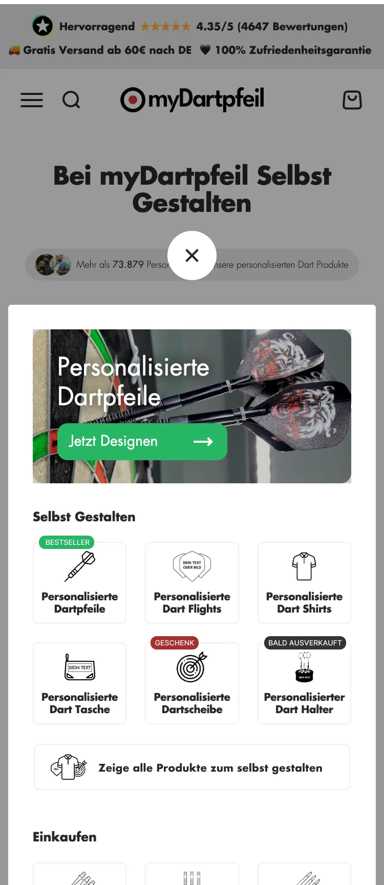
myDartpfeil
Mobile designs from client projects
Menu, filters and buy button sit where the thumb reaches them without shifting your grip.
On the small screen, what carries the decision comes first: image, price, rating and button.
The mobile menu shows the most important paths first. For new clients, we design it at no charge.
Selected trade magazines and media have covered our work and results.





Your contacts
You run a company, so do we. That is why in the intro call you talk to one of the two founders and managing directors: David Pehl or Anas Elimani. Whoever talks to you also makes the decisions and stays your contact while our design and development team works on your store. Whether we can help you, we tell you openly. If the answer is no, you hear that too.


Insights
Guides, checklists and articles from our work on online stores, from store migration to landing pages.
Article
When the unit price (Grundpreis) is mandatory in Germany, how to set it up in Shopify and how to check whether your theme shows it everywhere a price appears.

Article
Ten usability laws from psychology and research explain why an online store is easy or hard to use. With examples and review questions for your Shopify store.
Article
How to sell internationally with Shopify: set up markets, languages, currencies and domains, and decide when a second store is worth it. As of October 2026.
Before the intro call
Duration, cost, store platform: the short answers are here. Whatever remains open, we clarify in the intro call.
That depends on three things: the state your store is in, how much we are to take on, and which systems are connected to your store. A flat price that applies to every store would be a guess.
Bring to the intro call which platform your store runs on, how many products it carries and which systems are connected. Then we give you an estimate for your store right there.
For one cycle of 6 months. In the first month we check your tracking, after that each test takes weeks to months depending on order volume. Anything shorter does not produce numbers you can base a decision on.
After 6 months you decide whether to continue. Many of our clients have worked with us for over 3 years.
For A/B tests, the number of orders matters more than the number of visitors. As a rule of thumb: to prove a difference of 20 percent, a test needs around 400 orders per variant, for 10 percent around 1,600.
Conversion optimization does not require that, the A/B test is only one method within it. If your order volume is not enough, we work with customer surveys, UX audits (a review of the page for usability) and before-and-after comparisons, and state the uncertainty openly. Whether an A/B test is worthwhile at your order volume, we tell you before the engagement.
We start with your shopper's decision. The 545 method maps the path to purchase as five decisions and checks each against four forces from decision research. That is how we find the point where your store loses the most shoppers before we design anything.
Every change gets a reason beforehand: if we change X, we expect Y, because Z. We tell you about losers as openly as about winners. And you talk directly to David Pehl or Anas Elimani, the two founders.
Conversion optimization (CRO) is the whole program: we measure where your store loses shoppers, narrow down the spot, explain the cause, redesign the page and test the result. The goal: more of your visitors buy.
A/B testing is the measurement method within it. Some visitors see the current page, some the new one, and the numbers show which sells better. You can also book A/B testing on its own if your team already has its own ideas and designs and wants to test them properly.
No. How people decide does not depend on the store platform. That is why we also run audits and A/B tests for stores on Shopware, WooCommerce or other platforms.
Full implementation we handle in Shopify. On other platforms, your own development team implements the changes. If you want to switch to Shopify, we guide the migration.
The hypothesis list, with every reason and every result. If your team has its own ideas and designs, we test them in an A/B test against the current state. Whether we or your development team build in the winners depends on the store platform and is settled before the first test.
If you want to bring optimization fully in-house, we train your team and hand over the list, tests and results.
Your current store keeps selling while the new store is built behind password protection. Before the start, we define the scope in 19 points and map every connected system: ERP, CRM, point of sale, payment, shipping. If a ready-made integration exists, we set it up. If not, we build the Shopify side of the integration or a custom app.
For rankings we commit to a procedure, not a result: an inventory of all old URLs, a redirect plan, checks before launch and monitoring afterwards. For us, a migration is only finished when every old URL has a verified destination.
What clearly blocks shoppers, such as a usability error in the cart or unclear navigation, we fix early and without a test. In parallel, we check tracking and technology in the first month so that the numbers we build on afterwards are correct.
Reliable numbers from A/B tests take longer: weeks to months per test, depending on order volume. That is why we work in cycles of 6 months and tell you before the start how many orders a test needs in your store.
You talk for 30 minutes with David Pehl or Anas Elimani. You describe where your store stands, what you have already tried and which numbers you have. We ask questions until we understand your situation.
At the end we tell you openly whether we can help and how we would proceed. If the answer is no, you hear that too. There is no sales presentation, and no finished audit of your store either, 30 minutes are too short for that.
Let's talk about how your visitors decide and what your store can do about it. 30 minutes with David Pehl or Anas Elimani.
Privacy
This website uses cookies.
Some are required to run the site. Others help us improve the site and our services. You decide which ones we may use. Privacy policy