Zum Inhalt springen

For new clients: we design your mobile menu free of charge.See mobile designs

Data-driven store redesign

Store redesign: based on user behavior, not on taste.

In a store redesign we redesign your online store from the ground up, mobile first. The yardstick is the behavior of your buyers: where they search, where they hesitate, where they abandon. So in the end every design decision has a reason.

  • Every page along the 5 decisions
  • Designs in Figma, mobile view first
  • Implemented via a tested staging copy

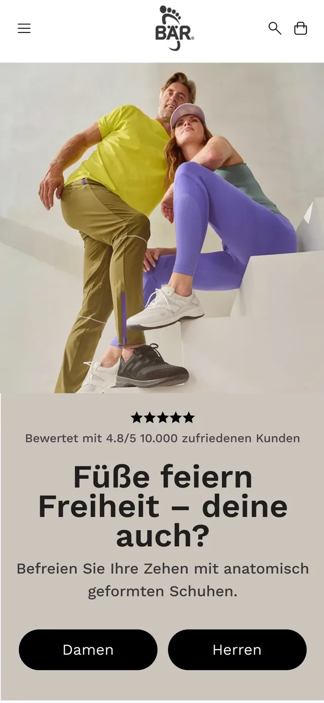
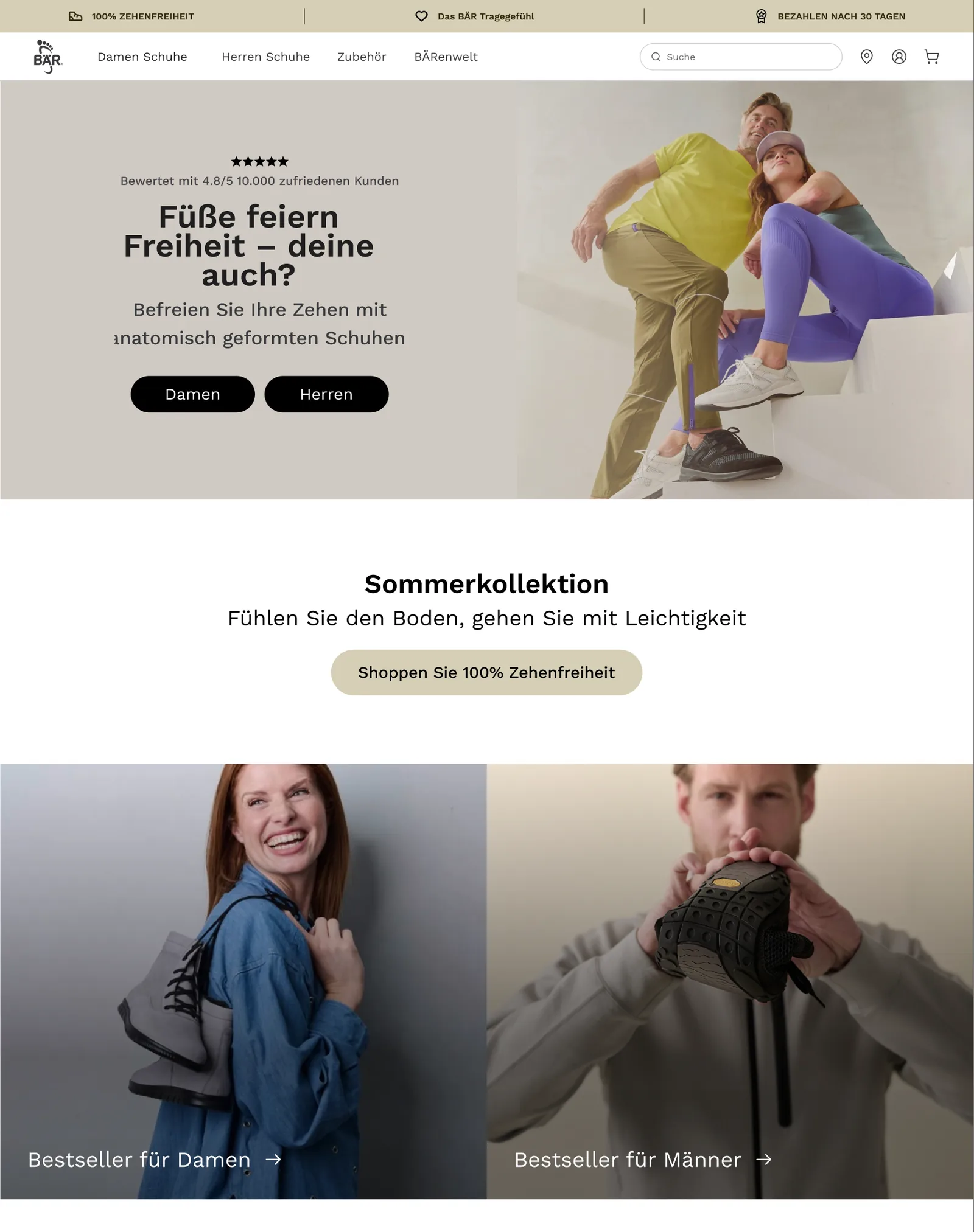
BÄR SchuheRebuilt on Shopify Plus: menu, home page, category, product page and cart redesigned. Clear design in the right places cut the return rate by 10%.

How your redesign is built

Your online store relaunch in five steps.

Behind this is our 545 method: 5 decisions lead to a purchase, 4 forces act on each one. In a redesign we apply it to every page where your buyers decide. Design only starts in step four.

  1. Schritt 1: Measure

    Where does your current store lose buyers?

    Before we draw anything new, we check whether your tracking records visits, carts and orders correctly. Then we collect the metric for each of the five decisions, split by mobile and desktop. These values are the benchmark for the new store.

    • Tracking of visits and orders checked
    • One metric per decision, from click to repeat purchase
    • Split by mobile and desktop
    • Baseline before the redesign saved

    ResultBaseline values that the new store has to measure up to after launch.
  2. Schritt 2: Narrow down

    Which pages carry the revenue, which hold it back?

    We look at which pages your buyers enter on, which paths lead to a purchase and where most of them abandon, counted in lost buyers. From this follows the scope: which pages are rebuilt, in which order and what stays.

    • Entry pages and the most common paths to purchase
    • Largest losses, counted in buyers
    • Order of the pages, with reasons
    • What demonstrably sells today stays

    ResultA scope with an order: which pages are redesigned and why.

  3. Schritt 3: Explain

    Why do your buyers hesitate exactly there?

    Numbers show where buyers drop off. Why they do, we learn from what your customers say in surveys, reviews and forums. We review every page for usability, with the eye of over 300 store audits. We assign every cause to one of the four forces.

    • Customer voices from surveys, reviews, forums
    • Every page reviewed for usability
    • Causes sorted by the four forces
    • Reasons in the format If, Then, Because

    ResultFor every page, your buyers' questions and the reasoning for how the new page answers them.

  4. Schritt 4: Design

    Designed for the thumb, carried over to the big screen.

    We design in Figma, mobile view first: home page, menu, category, product page, cart and the pages your product range needs. For every page you get the reasoning from step 3. You see the designs and approve them before we build.

    • Design in Figma, mobile view first
    • Home page, menu, category, product page, cart
    • Reasoning for every page
    • Your approval before implementation

    ResultApproved designs for mobile and desktop, ready for implementation.

  5. Schritt 5: Test

    Tested on the staging copy, measured after launch.

    We first build the new store in a staging copy of your store and check display and load time there. Your store keeps selling unchanged during this time. After launch we compare the metrics against the values from step 1. If the order volume is enough, we check individual pages in an A/B test.

    • Implementation in a staging copy first
    • Display and load time on mobile and desktop
    • Comparison with the values before the redesign
    • A/B test of individual pages when the volume is enough

    ResultYour new store, live, and an honest comparison with the state before.

Scope

Every page where your buyer decides.

A redesign changes the user experience of your entire store, meaning how easily your customers find, compare and order. That is why we design all pages up to the checkout, each starting from the question your buyer asks there.

  1. Home page

    Am I in the right place? The first screen shows at a glance what you sell and for whom. Below it are the paths into your product range, reachable with one hand on mobile.

  2. Menu and filters

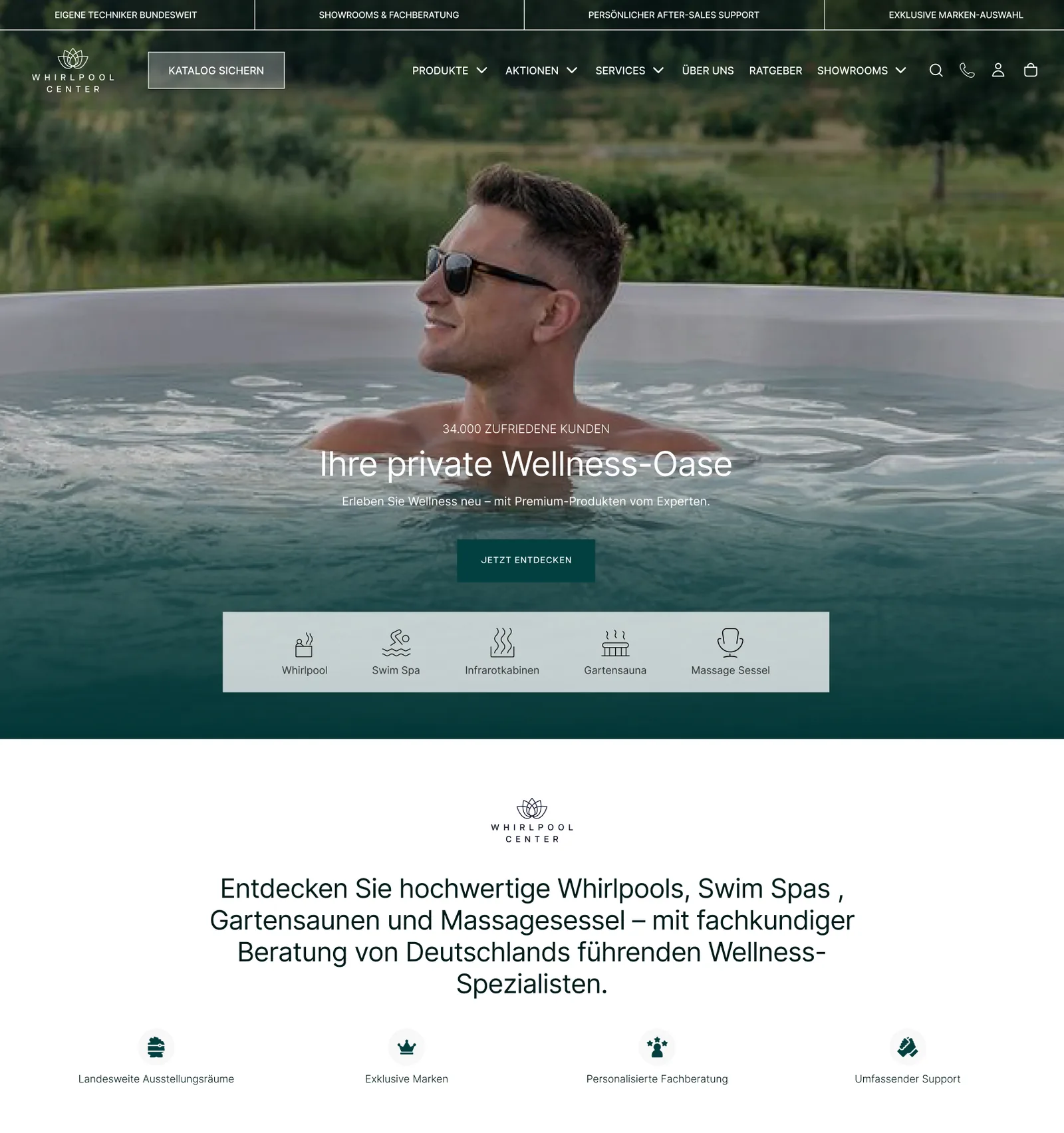
    Menu, mega menu, mobile menu and filters lead to the product in a few steps, even through a large range. For djoon we built a new desktop menu and a filter bar.

  3. Category page

    This is where your buyer decides what to click: image, title, price and stars of the product tile. We design tiles that let similar products be told apart.

  4. Product page

    Why exactly this product? Images, benefits in your customers' words, variants and reviews sit where the question arises. Price and buy button stay in the first screen.

  5. Cart

    What could go wrong? Total cost, delivery time and return policy are shown before the checkout. For Dogs’n Tiger we rebuilt the cart, with a progress bar to free shipping.

  6. Topic pages

    Some products need explaining before anyone buys them. For BÄR Schuhe we built dedicated pages on hallux valgus and toe freedom, for people who search for their foot problem.

Buying psychology

Four forces decide whether a page sells.

Whether a page sells depends on four forces that act on every purchase decision. Three of them were described by the psychologist Daniel Kahneman, winner of the Nobel Prize in Economics. We check every design against all four.

  1. Ease

    The more your buyer has to puzzle, the sooner they postpone the purchase. Every page gets one clear main action, plain words and a short load time, on mobile too.

  2. Framing

    The same information works differently depending on how it is phrased and what stands next to it. We define what goes in the first screen and which detail sits next to the price.

  3. Loss

    Losses weigh more than gains of the same size. Return policy, delivery time and total cost are therefore placed where the doubt arises. We do not use fake countdowns.

  4. Reassurance

    Those who are unsure follow others. Reviews and customer voices sit where they answer a question, for example right next to the buy button.

As featured in:

Selected trade magazines and media have covered our work and results.

  • This is Marketing
  • Kameleoon
  • Founders League
  • CRO.CAFE
  • Merchant Inspiration

Questions about the store redesign

Common questions about the redesign.

Cost, duration, risk, store platform: here are the short answers. Whatever stays open, we clear up in the intro call.

Ask your open questions

What does a store redesign cost?

It depends above all on how many page types are rebuilt, how large your product range is and which platform your store runs on. Redesigning the product page and cart is a different project from a complete relaunch with menu, filters and topic pages.

We give you a binding price once the scope is set. Before that, it would be a guess.

How long does an online store relaunch take?

It depends on the number of pages, on your store platform and on how quickly you approve designs. There is no duration that fits every store.

We give you the schedule together with the price, once the scope is set. While we build, your current store keeps selling unchanged.

Do I need a redesign, or are individual changes enough?

If your store loses its buyers mainly at one spot, a targeted change that we check in an A/B test may be enough. That is conversion optimization: one spot after another, measured in cycles of 6 months.

A redesign pays off when the whole store no longer fits brand and product range. For example, when the range has grown or the store is hard to use on mobile. Which fits better, we tell you openly in the intro call.

Can a redesign lower my revenue?

Yes, that can happen. A new store also changes spots that sell well today, and a design that people like does not automatically sell better.

That is why we measure before the redesign, keep what demonstrably sells, and build on a staging copy first. Copy and headlines that your store is found by on Google today, we check before we replace them. After launch we compare the metrics with the state before.

Why do you design for mobile first?

Because in many stores the largest share of visitors comes via mobile. There the purchase happens on a small screen, often with one hand. How large that share is for you, we see in the first step.

We first define what goes in the first screen and where the thumb reaches menu, filters and buy button. Then we carry the design over to the big screen.

Do you also design stores that do not run on Shopify?

Yes. How people decide does not depend on the store platform, and the designs in Figma are created independently of it. A Shopify redesign we implement ourselves and check in a staging copy first.

On other platforms, your own development team implements our designs. If you want to switch to Shopify as part of the redesign, we also handle the migration.

Does your store still fit your brand?

Tell us in 30 minutes where your store stands today and what the new store should achieve. You speak with David Pehl or Anas Elimani and hear openly whether a redesign is the right path or whether targeted changes bring more.

Discuss your redesign

  • 30 minutes, no obligation
  • Directly with a Managing Director
  • Experience from 180+ stores we have worked on

We are proud to be a Shopify Premier Partner.

Clicking loads the chat of our provider. No data is sent to them before that.